HEARTH: more than just a play on words combining heart and earth, it is a richly evocative name for the most vivid incarnation of a holistic wellness brand. At its genesis was a guiding desire to create a brand in the Asian territory that went against the grain of the uniform and sterile expressions used by the competition.
PLAY FOR CARE
OUR MISSIONS
BRAND CONCEPT | BRAND PLATFORM |BRANDING IDENTITY|TONE OF VOICE | COMMUNICATION TERRITORY | RETAIL IDENTITY|CONTENT DESIGN AND PRODUCTION

DISRUPTIVE WELL-BEING CODES
Mandated to provide a wide range of expertise across a broad spectrum of deliverables, our strategic and creative teams worked together to provide the brand with a 360° support. The first step was to define the brand’s fundamentals – brand name, market positioning, manifesto, and tone of voice – which were developed in parallel with the brand’s visual identity, including the logotype, emblem, and the color palette.

THE ART AND SUBSTANCE
OF WELLNESS
Instead of turning to the minimalism prevalent in the wellness category, our teams preferred to create a colorful and modular concept store that could evolve with the brands and the seasons. This approach defines all the principles of the space, atmosphere, and point-of-sale experiences that follow. The heart of the boutique is a successive discovery of HEARTH’s flagship products and new partner brands – an invitation to be fully immersed in textures, colors, and words. Here, there, everywhere, the brand tells its story as the consumer wanders.

NATURE AND CONSUMER
IN PERFECT HARMONY
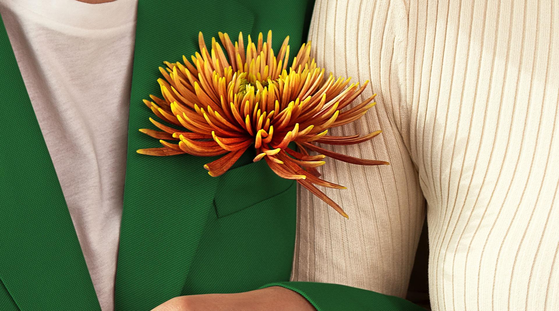
The brand content teams then completed this 360° project by conceptualizing and producing the key visual, as well as static and animated collateral assets. With spontaneity, these elements place the consumer right at the heart of the experience. Nature can be felt everywhere; it serves as a warm backdrop. With HEARTH, wellness has never been so aptly named!


