Driven by the ambition to introduce its Chinese silk and cashmere scarves to the international clientele, 嫵WOO called upon us to define its brand territory and redesign its identity across all visual codes.
OUR MISSIONS
BRAND STRATEGY | VISUAL IDENTITY |PACKAGING IDENTITY|RETAIL IDENTITY|


THE MEETING BETWEEN THE EAST AND THE WEST.
The brand’s roots in traditional craftsmanship and Chinese culture proved to be two pillars of meaning and inspiration for the strategic and creative teams. Instead of distancing themselves from them to anchor 嫵WOO in more Westernized codes, our teams decided to elevate them through the prism of a more deliberately subtle and evocative contemporaneity that bridges the two worlds.

BLOOMING SENSUALITY
A poetic brand territory reminiscent of the symbol 嫵WOO and the precious bud of the magnolia flower. A proposition based on fluidity, movement and a sensuality that adapts to the profiles of customers who recognize themselves in it.
The identity principles were rethought and new brand values were created to allow the brand to enter the upper range of the international market. The packaging identity was developed for all permanent collections. Sensuality is fully at play, unfolding and expressing itself in a poetic manner.
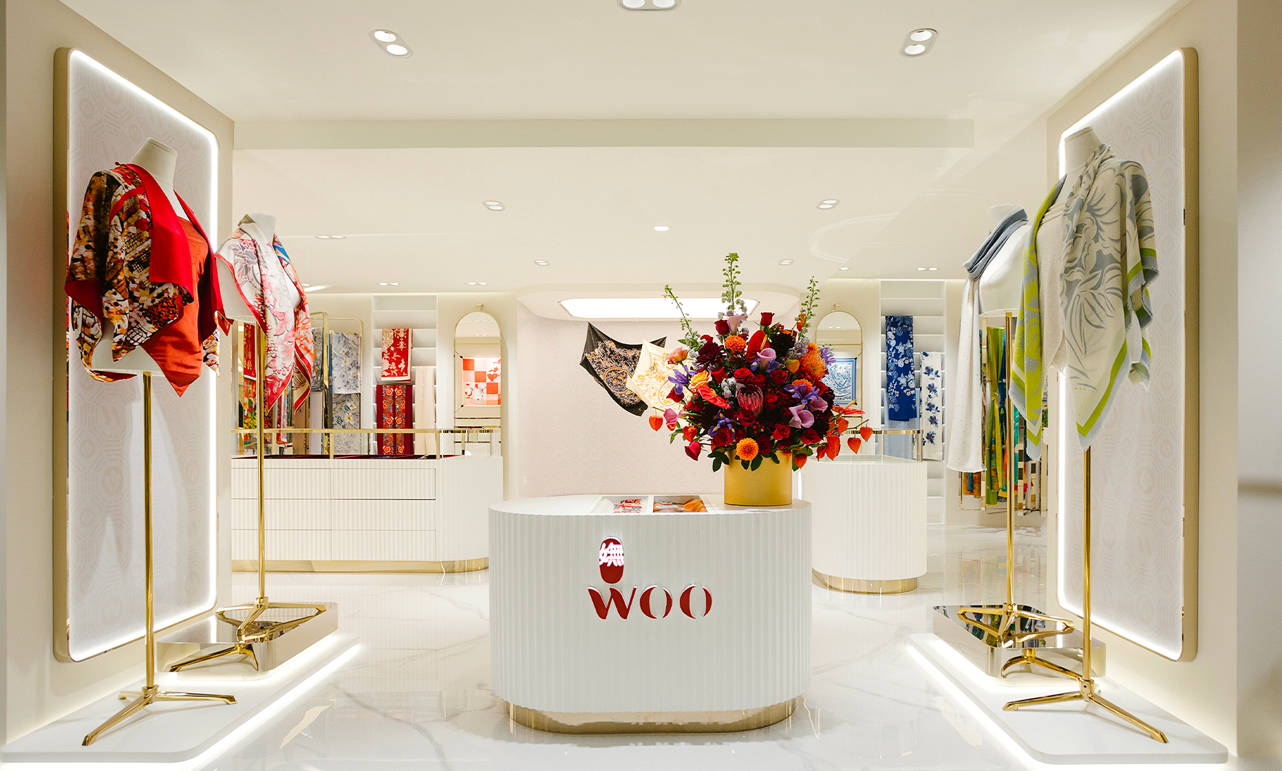
Finally, the retail identity brings this blossoming femininity to life and completes 嫵WOO’s legitimacy in the international landscape. Fluid lines, a petal-shaped capsule in the centre of the shop, and of course the predominance of magnolia red…


